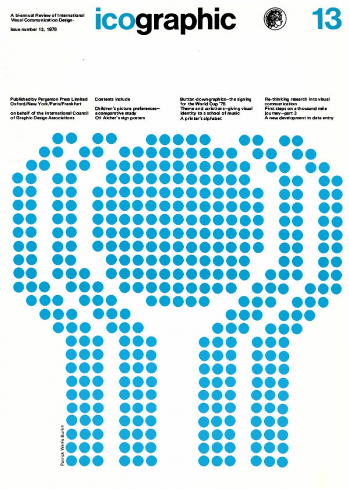
icographic 13
1978 Icographic
TABLE OF CONTENTS
02 Children's picture preferences- a comparative study C J Ladan and J Frascara
The authors describe a cross-cultural study of children's picture preferences. Children were shown specially prepared pictures of a pair of giraffes, each painted in a different manner. In one picture, for example, the animals were represented naturalistically, in another they were stylised. The complexity of the background was also varied, as were the outlines ot the figures, these being varied from hard-edged to soft-edged.
The authors' expectation was that age, sex, and geographic region would influence children's preferences along three dimensions, which they termed 'edge,' 'form' and 'simplicity-complexity.' The study described involved Canadian schoolchildren of both sexes, between the ages of 7-11, and these results were compared with an earlier study of Argentinian boys and girls within the same age range. The authors find that, in general, children of both cultures typically prefer natural images incorporating detail and with a good analysis of contours, although some age/sex exceptions are noted.
05 Fog signals-experimental illuminated signs for Britain
We show a group of traffic signs to be tested experimentally on British roads during the next few months. They have been specifically developed as fog hazard warnings. Using computer-type dots, any one of these 12 signs can be flashed on to an illuminated panel, which also has flashing warning lights at each corner.
06 Otl Aicher's sign posters
Readers of our last issue wilI remember that we featured Otl Aicher's ingenious 'off-the-peg' graphic signing system. These four delightful posters, which subtly announce the attractions of lsny and Argenbuehl in the Algau region of Austria, are from the same design office.
As a series they echo the style that was created for the sign 'alphabet.' Indeed, many of the individual elements have been taken from the signing system, either directly, or in some modified form. As a reminder, here are some of the signs that figure in these particular posters.
07 A new development in data entry
The article briefly describes the general principles of a newly developed Data Entry machine. This device is capable of recognising ordinary print in any typestyle, combinations font, and a wide range of sizes. This information it can then convert to computer code, either on disc, tape, or teletype compatible interface.
09 Button-down-graphics the signing for the World Cup '78
The article describes and illustrates the signing system developed by Gui Bonsiepe and Carlos A Mendez-Mosquera for the latest World Cup football competition held in Argentina recently. It uses an ingenious system of plastic buttons that can be positioned upon perforated metal plates, so as to generate the various required signs. The system is modular and was produced in a range of four different sizes.
14 First steps on a thousand mile journey-part 3 Patrick Wallis Burke
The author continues his analysis of the fundamental differences between ideogrammatic and alphabetic writing. He describes some of the problems that have occurred over various attempts to write Chinese in Latin characters.
He shows how the Chinese writing system manages to solve the phonetic problems that occur when rendering foreign words of various kinds, and includes some examples of modern technical terms in their Chinese forms. He concludes with some examples of 'concrete' poetry that make use of Chinese characters.
22 A printer's alphabet
The letterforms of the Latin alphabet seem to have fascinated artists and designers throughout the many centuries since it was invented. We show here a recent 'Printers Alphabet', invented by the Dutch artist, Pam Rueter, which should delight all publishers, printers and typographers. The letters, which are wood engravings, will shortly appear in book form, published by the Gaillarde Press of Zutphen, in the Netherlands.
24 An architect's alphabet
Whilst on the same subject, here are two letter designs from the extra ordinary 'Architectural Alphabet' of Johann David Steingruber (1702-87), who was born in Ansbach in Bavaria and was a leading architect of his time. During his working life Steingruber designed some 250 houses and 50 churches, most of which are still standing.
26 Theme and variations giving visual identity to a school of music Keith Murgatroyd
The author briefly describes and illustrates his work as design consultant to the Royal Nrirthern College of Music, Manchester, England. This would seem to be a very rare example of an enlightened educational establishment which, although primarily concerned with sound, was also determined to give itself a strong visual identity.
28 Re-thinking research into visual communication Jocelyn Chapman
The author is sceptical about much of current research into visual communication. She points out that although an immense amount of research has been carried out, no general principles of any kind have emerged that might aid designers to improve their performance.
Most research, she argues, concerns itself only with those factors which can be measured. After Iisting the various approaches that can be taken to research, she goes on to suggest that the task of finding out what people really feel about particular items of communication requires methods of research that include a genuine understanding of the people concerned.
All too often, present-day methods are simply aimed at getting useful feedback so that the producers can do a better job. The emphasis is not on the person looking. He or she is merely a 'subject' in an experiment. Researchers do not usually care about them or respect their personal opinions. As a result, the wisdom of ordinary people is left untapped because we insist on using 'experts.' As she remarks, "when you know and respect someone you cannot treat them as a 'subject. The questions you are asking them from your book seem suddenly absurd. The new methods must include empathy, respect and caring for and understanding the whole person."
32 Correspondance
