Netherlands-Russia road show
10.09.2013 Features
Bettina Schulz
In this article, originally published in the September issue of Novum World of Graphic Design Magazine, we explore the unique the Moscow Design Museum.
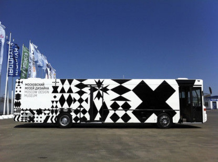
The Moscow Design Museum is in many respects unique: for one thing, it’s Russia’s first and so far only design museum; and for another, it is a fully mobile travelling exhibition… i.e. a bus!
![]()
Reassignment of a standard bus to museum duties is not exactly usual practice anywhere, nor is it a Russian thing in particular – but who’s to say that this will not become a viable model for the future exhibition scene? At any rate, a handful of creatives in Moscow undertook the experiment and have made a success of it – though not without input from the Netherlands design agency Lava, which handled the corporate design side of things and also, as a founding partner, aims to influence the museum’s programme. How did this Dutch-Russian collaboration come about in the first place? Sometimes it only takes a chat between two people to start a ball rolling, and it was Alexandra Sankova – she had long cherished her vision of a design museum – who put the idea of a collaborative venture to Hans Wolbers, founder of Lava, when he was in Moscow to give a lecture. She had two reasons for preferring to go abroad for a creative partner: she wanted the museum to have international orientation, and also to avoid bringing such a prestigious project into the crossfire of rivalry between Russian design agencies.
![]()
Initial back-of-envelope discussions soon blossomed into a productive partnership, with Lava happy to undertake the design of a clear visual identity with high recognition value. Early on, the creatives liked the idea of a design inspired by Russian Constructivism. "It was just that we thought of it as typically Russian," Lava remembers. "And what response did this idea get? Too heavy, too big! It soon became clear that our partners wanted to correct the clichéd notions about Russian design – it was time to shake off that ‘great lumbering dinosaur’ image once and for all." The look had to be more modern, international, accessible. And so Lava eventually anchored the museum’s visual identity in an equally old but also highly distinctive element of Russian design heritage: the way forward proved to lie in the typical patterning of Russian cut glass. "These geometrical figures provided the basic scheme for the dynamic visual identity. These, when transposed to a grid, or details selected from them, proved ideally flexible for application to the communication media, the exhibition designs and the designs for the bus itself and the catalogues. A further point was that every Russian household has an item or two of this crystalware at home, and we wanted that to be echoed in the museum – it’s open to everyone." Adding a gentle, rounded font for the texts, and keeping everything in black and white, the Dutch creatives have succeeded not simply in getting a creative bus rolling, but also in producing a visual identity good for many miles on the road ahead.
![]()
http://www.moscowdesignmuseum.ru
www.lava.nl
Reprinted with permission from NOVUM – World of Graphic Design, ©2013
All rights reserved. This first appeared in NOVUM – World of Graphic Design 09/13. NOVUM World of Graphic Design
![]()
Bettina Schulz (born 1974 in Munich) has been editor-in-chief of the international journal novum World of Graphic Design () since 2001. She joined the editorial staff of the magazine in 1994. Mrs Schulz also works as a freelance writer and editor for national and international magazines and for a range of clients in different sectors. Furthermore she is a co-founder of the Creative Paper Conference in Munich.
In this article, originally published in the September issue of Novum World of Graphic Design Magazine, we explore the unique the Moscow Design Museum.
The Moscow Design Museum is in many respects unique: for one thing, it’s Russia’s first and so far only design museum; and for another, it is a fully mobile travelling exhibition… i.e. a bus!
Reassignment of a standard bus to museum duties is not exactly usual practice anywhere, nor is it a Russian thing in particular – but who’s to say that this will not become a viable model for the future exhibition scene? At any rate, a handful of creatives in Moscow undertook the experiment and have made a success of it – though not without input from the Netherlands design agency Lava, which handled the corporate design side of things and also, as a founding partner, aims to influence the museum’s programme. How did this Dutch-Russian collaboration come about in the first place? Sometimes it only takes a chat between two people to start a ball rolling, and it was Alexandra Sankova – she had long cherished her vision of a design museum – who put the idea of a collaborative venture to Hans Wolbers, founder of Lava, when he was in Moscow to give a lecture. She had two reasons for preferring to go abroad for a creative partner: she wanted the museum to have international orientation, and also to avoid bringing such a prestigious project into the crossfire of rivalry between Russian design agencies.
Initial back-of-envelope discussions soon blossomed into a productive partnership, with Lava happy to undertake the design of a clear visual identity with high recognition value. Early on, the creatives liked the idea of a design inspired by Russian Constructivism. "It was just that we thought of it as typically Russian," Lava remembers. "And what response did this idea get? Too heavy, too big! It soon became clear that our partners wanted to correct the clichéd notions about Russian design – it was time to shake off that ‘great lumbering dinosaur’ image once and for all." The look had to be more modern, international, accessible. And so Lava eventually anchored the museum’s visual identity in an equally old but also highly distinctive element of Russian design heritage: the way forward proved to lie in the typical patterning of Russian cut glass. "These geometrical figures provided the basic scheme for the dynamic visual identity. These, when transposed to a grid, or details selected from them, proved ideally flexible for application to the communication media, the exhibition designs and the designs for the bus itself and the catalogues. A further point was that every Russian household has an item or two of this crystalware at home, and we wanted that to be echoed in the museum – it’s open to everyone." Adding a gentle, rounded font for the texts, and keeping everything in black and white, the Dutch creatives have succeeded not simply in getting a creative bus rolling, but also in producing a visual identity good for many miles on the road ahead.
http://www.moscowdesignmuseum.ru
www.lava.nl
Reprinted with permission from NOVUM – World of Graphic Design, ©2013
All rights reserved. This first appeared in NOVUM – World of Graphic Design 09/13. NOVUM World of Graphic Design
About the author
Bettina Schulz (born 1974 in Munich) has been editor-in-chief of the international journal novum World of Graphic Design () since 2001. She joined the editorial staff of the magazine in 1994. Mrs Schulz also works as a freelance writer and editor for national and international magazines and for a range of clients in different sectors. Furthermore she is a co-founder of the Creative Paper Conference in Munich.

relatedarticles
03.14.2022 Features
goodbye! and next steps for colleague and friend alexey lazarev
05.27.2020 Features
explorations in ethical design: meditations on equality
05.16.2017 Features
RCA launches new programme: MA Digital Direction
12.14.2016 Features
Interview | Ermolaev Bureau (Moscow)
05.11.2016 Features