An identity for Hungary
13.03.2014 Features
Christine Moosmann
In this article, originally published in the March issue of Novum World of Graphic Design Magazine, we explore how the Hungarian Miklós Kiss, offered a corporate identity design as a gift to his native land to mark its National Day.
The runaway success of the ‘I Love NY’ logo in the Seventies led to a spate of attempts by cities and regions to follow Milton Glaser’s example and establish themselves as brands. There was much less interest, however, in exploring the potential for a corporate identity at national level. And so the Hungarian designer Miklós Kiss took matters into his own hands: he would design one himself and offer it as a gift to his native land to mark its National Day.
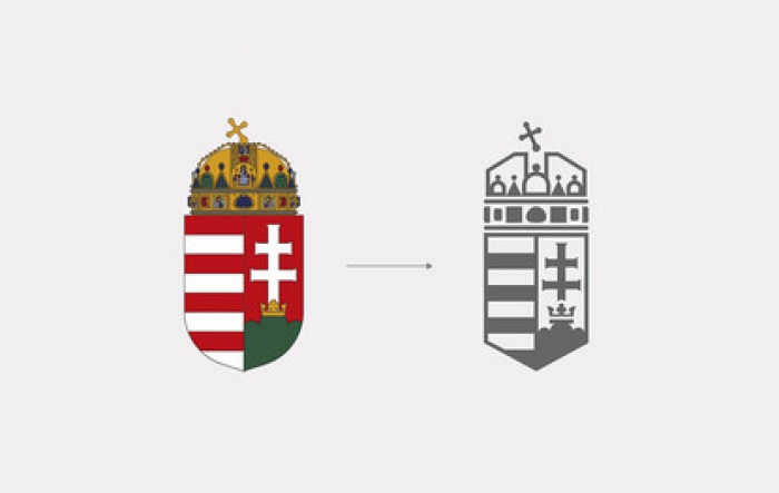
One of the advantages of working without a commission is the lack of constraints. Miklós Kiss accordingly took a simple and direct approach to the task of creating an appropriate visual identity: he started with the national coat-of-arms. It had originated in the mid-19th century, having been put together from various medieval elements; subsequently it underwent several modifications. Then in 1867, after the founding of the Dual Monarchy of Austria-Hungary, it was formally declared the official symbol. In 1990, following the collapse of the Communist system, the historic coat-of-arms with its crown was reinstated. Miklós Kiss redesigned the emblem in such a way as to retain all the heraldically important elements, while nevertheless imparting a simplified, more contemporary appearance to the image. The font he chose – its proportions harmonised well with the coat-of-arms – was Neuzeit Grotesk, introduced in 1929. In combination with a colour palette based on the Hungarian national colours of red, white and green, this produced a visual language suited for use by the organs of government and all the various nationwide organisations. Invitations, business stationery and official communications across the board thus benefit from consistent styling. Subsequently Kiss followed the same procedure with the arms of Budapest, with the result that the capital city’s emblem now fits naturally, yet quite recognisably, into the Hungarian nation’s corporate design.
People encounter national symbols all the time and come to absorb them, whether it´s tourists only seeing them during brief visits, or the country´s citizens who keep encountering them. So nation branding is not mere window-dressing, but reflects the nation’s identity and how it feels about itself. We will be interested to see whether the Hungarian nation accepts the gift it has been offered.
Reprinted with permission from NOVUM – World of Graphic Design, ©2014 All rights reserved. This first appeared in NOVUM – World of Graphic Design 03/14. NOVUM World of Graphic Design
About the author
Christine Moosmann is a journalist based in Munich, Germany. She started writing for various publications in 2000, amongst them novum- World of Graphic Design (est. 1924), one of the most renowned design magazines worldwide. She is now deputy editor-in-chief of novum.

related
articles
goodbye! and next steps for colleague and friend alexey lazarev

explorations in ethical design: meditations on equality
RCA launches new programme: MA Digital Direction
Interview | Ermolaev Bureau (Moscow)
