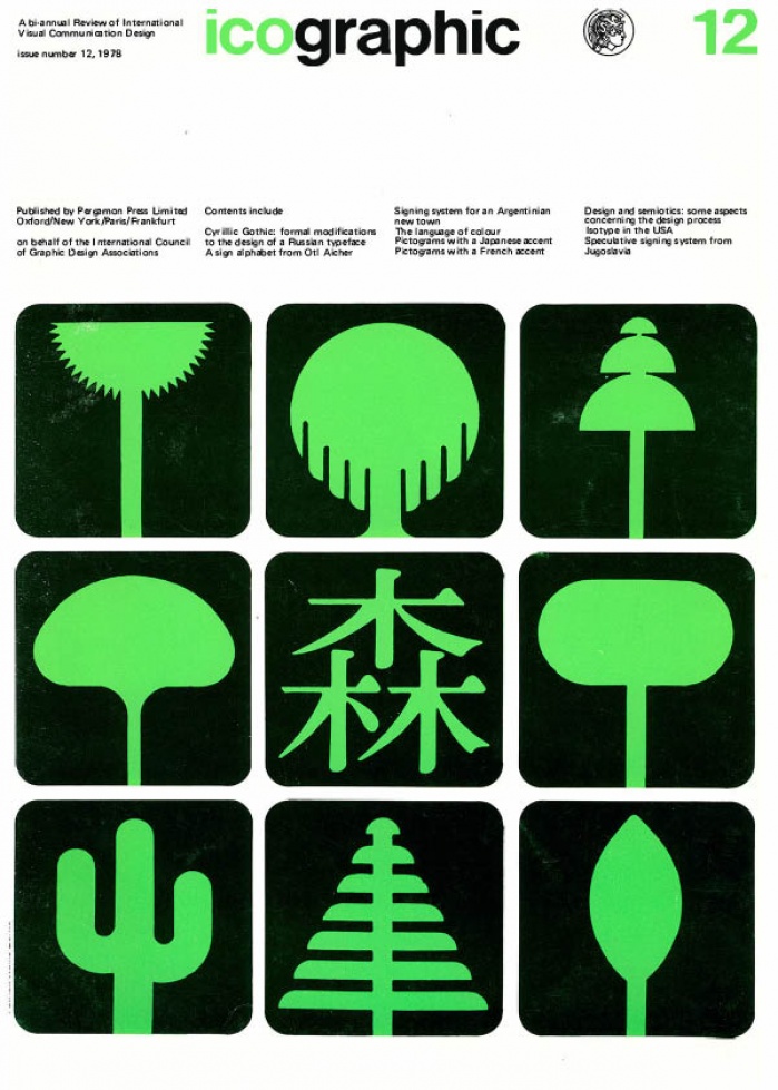
icographic 12
1978 Icographic
TABLE OF CONTENTS
02 Cyrillic Gothic: formal modifications to the design of a Russian typeface Andre Gurtler and Christian Mengelt
The authors describe some of the problems involved in designing a new four-weight, sans-serif Cyrillic type face. Their text and its illustrations, show how individual characters were modified so as to giv,I! an overall consistency to their proposed alphabet.
05 Signing system for an Argentinian new town
The article describes and illustrates a signing system developed for a new Argentinian town.
The scheme, besides attempting to provide a rational visual communi cation system for this particular housing complex, was also designed to serve as a possible model for other developments of this kind throughout Argentina. The scheme makes extensive use of pictographic signs. Many were developed to serve as a means of identifying the various facilities offered by the housing complex-schools, shopping centres, supermarkets, cinemas, etc. In addition, each of the sections, streets, patios or plazas, were given identifying names which could be portrayed pictorially.
09 The language of colour Tom Porter and Byron Mikellides
The authors argue that colour is a language that, to some extent, modern man seems to have forgotten. As a result, the way in which we use colour in our everyday world is almost completely arbitrary, since we have lost the ability to manipulate either the biological or symbolic languages of colour. They instance much interesting research into the effects of colour on human performance and motivation, and they point to a wide discrepancy between popular colour preferences and those of the 'sophisticated' architect and designer. They believe that designers need to learn far more about colour and that this, in turn, might prompt a far more adventurous use of colour in our present-day environment.
11 lsotype in the USA
We publish a further selection of pictographic symbols produced in America by Pictorial Statistics Inc, under the direction of the late Rudolf Modley. They date from the middle of the 1930s to the beginning of the 1940s. They already display a certain amount of period charm, but we are happy to include them as a further tribute to the work of a man who was for many years a leading spokesman and critic of pictorial signing.
16 Speculative international signing system from Yugoslavia
By far the most controversial work in signing systems in recent years is that of the Yugoslavian architect Radomir Vukovic. This work appeared in a publication issued by the Union of Engineers and Technicians of Yugoslavia, entitled 'New aspects of informing.' It was produced in response to this organization's belief that there was no adequate visual communication system for users of the various transport and traffic systems.
18 Pictograms with a Japanese accent
Two sets of pictographic signs, both developed in Japan at different periods, demonstrate similar approaches to current international signing. Yet, in spite of similar pictorial content, they remain identifiably Japanese. And they prompt the question; 'Does picture language have its own regional dialects?'
19 A sign alphabet from Otl Aicher
The article describes and illustrates a new range of signs developed by Otl Aicher for the firm of ERCO. In this massive undertaking an attempt has been made to provide a wide range of pictographic signs for many kinds of organizations-schools, exhibitions, building sites, airports, etc. The system is modular and caters for both illuminated and unilluminated signs, in three basic sizes and with variations of fixing.
28 Pictograms with a French accent Ian Mclaren and Claude Braunstein
The authors, who have worked together for a number of years, show some of the unified sets of symbols they have evolved for use in cartography and on underground rail signing.
30 Design and semiotics: some aspects concerning the design process Hanno HJ Ehses
The author argues that only when the designer is willing to accept that the process which begins with design can be analysed by exposing the nature of its structure, only then can he begin to exert a certain amount of control upon the effect of his product and to use it as a precise medium for the presentation of visual information.
32 Tailpiece—danger signs for Europe Patrick Wallis Burke
The author briefly discusses the Hazchem scheme, a recently introduced system for the labelling of potentially dangerous chemicals that are transported by road. He is sceptical about the standard of the pictographic signing used, which gives little hint as to the real dangers of such products.
